Styling Your Application
Now that your application is up and running, you might want to customize its appearance to better fit your client's branding or preferences.
Styling Overview
SOKit UI is built on top of Tailwind CSS, a utility-first CSS framework. This allows you to
apply styles directly in your JSX via Tailwind classes or by modifying the index.css file located in the src/styles
folder.
Customizing via className
You can easily style components in your JSX using Tailwind’s utility classes via the className prop. Most SOKit UI
components support this prop, allowing for direct customization.
Let’s take the SectionContainer component from the General Tab as an example. It wraps its
children inside a styled div. Here’s how you could modify its background color using Tailwind classes:
import {
  DatePicker,
  Input,
  Section,
  SectionContainer,
  SectionTitle,
  Select,
} from 'so-kit-ui';

const legalForms = [
  {
    code: 'LLC',
    description: 'Limited Liability Company',
  },
  {
    code: 'CORP',
    description: 'Corporation',
  },
  {
    code: 'SOLO',
    description: 'Sole Proprietorship',
  },
  {
    code: 'PART',
    description: 'Partnership',
  },
  {
    code: 'LLP',
    description: 'Limited Liability Partnership',
  },
  {
    code: 'OT',
    description: 'Other',
  },
];

export const companyTypes = [
  {
    code: 'IT',
    description: 'Information Technology',
  },
  {
    code: 'ED',
    description: 'Education',
  },
  {
    code: 'RE',
    description: 'Research',
  },
  {
    code: 'FI',
    description: 'Financial',
  },
  {
    code: 'TR',
    description: 'Trade',
  },
  {
    code: 'OT',
    description: 'Other',
  },
];

const General = () => {
  return (
    <SectionContainer
      padded
      page
      className={'bg-secondary-400'}
    >
      <Section columns={2}>
        <SectionTitle>title.general.info</SectionTitle>
        <Section.Elements>
          <Input id='companyName'/>
          <Select
            id='legalForm'
            options={legalForms}
            vlCodeDescription
            valueOnly
          />
          <DatePicker id='establishedDate'/>
          <Input
            id='capital'
            type='decimal'
            minValue={0}
            formatOptions={{
              maximumFractionDigits: 2,
            }}
          />
          <Input
            id='employees'
            type='number'
          />
          <Select
            id='type'
            options={companyTypes}
            vlCodeDescription
          />
        </Section.Elements>
      </Section>
      <Section>
        <SectionTitle>title.general.address</SectionTitle>
        <Section.Elements>
          <Input id='address.street'/>
          <Input id='address.city'/>
          <Input id='address.state'/>
          <Input
            id='address.zip'
            type='number'
          />
        </Section.Elements>
      </Section>
      <Section>
        <SectionTitle>title.general.contact</SectionTitle>
        <Section.Elements>
          <Input id='website'/>
          <Input
            id='phone'
            type='number'
          />
          <Input id='email'/>
        </Section.Elements>
      </Section>
    </SectionContainer>
  );
};

export default General;
To run and test the change in mock mode:
pnpm mock:dev
💡 Don’t worry about mock server errors. For this styling test, you can simply dismiss any errors and focus on the visual changes.
As a result, the SectionContainer will now have a yellow background if your secondary-400 color in the theme is set
to yellow.
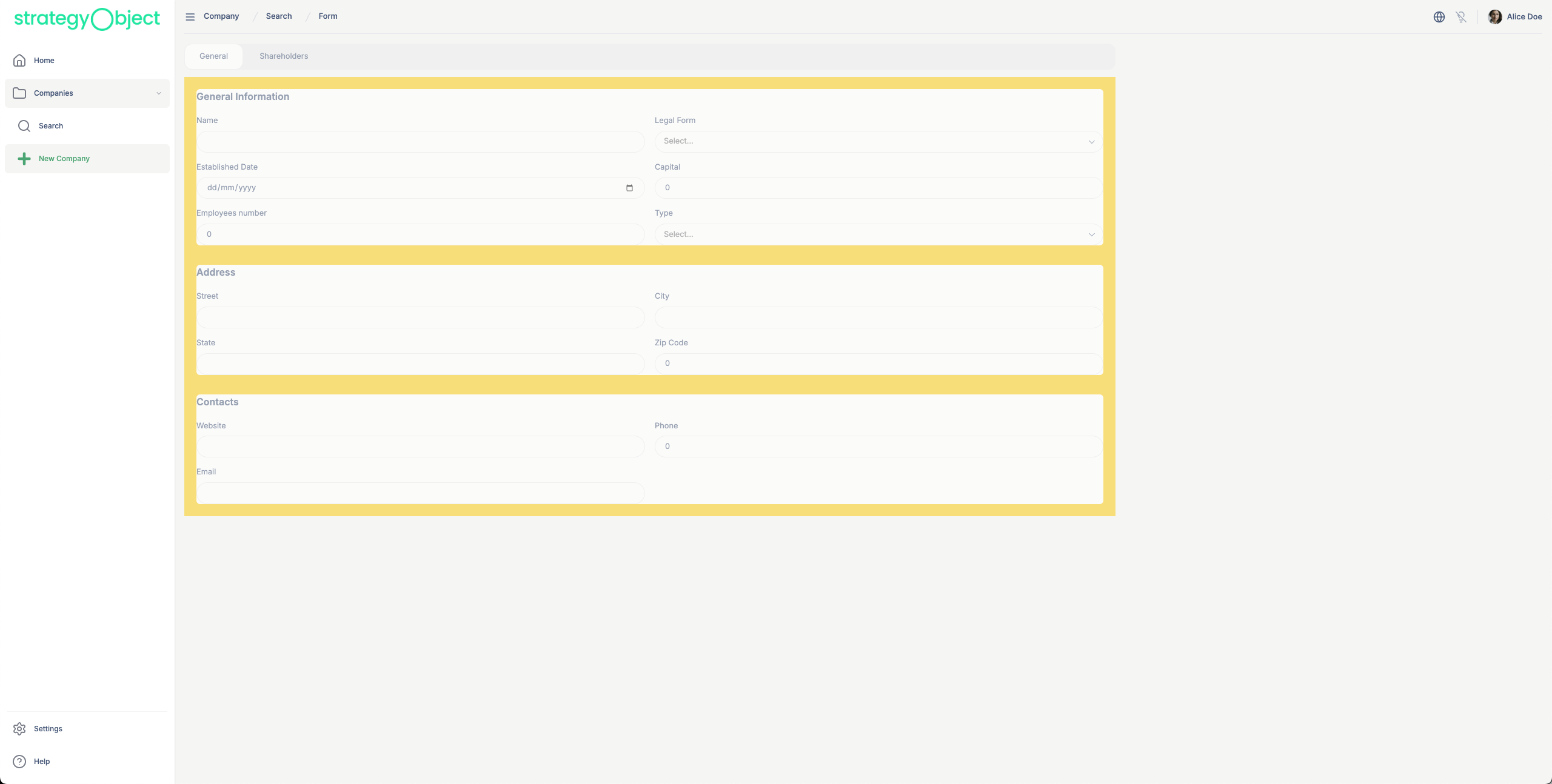
Always remember: if you use bg-* theming color classes, like primary, secondary..., for containers with text
inside, make sure to also use appropriate text-on-* theme color classes. This ensures that your text remains readable
against the background.
Customizing via index.css
For more global or theme-level changes, you can modify the index.css file located in src/styles. This is where you
can inject your own theme variables or override existing ones.
Here’s an example of how to change the default primary color to red by overriding the Tailwind theme:
@import "tailwindcss";

@import "so-kit-ui/styles";

@source "../../src";
@source "../../node_modules/so-kit-ui/dist";

@theme {
    /*Add your custom theme here*/
    --color-primary-500: #ff0000;
}

@layer base {
    [data-theme="dark"] {
        /*Add your custom theme here*/
    }
}

*:focus-visible {
    @apply outline-none;
}

/*Add your custom CSS here*/

[data-theme="dark"] {
    /*Add your custom dark CSS here*/
}
Once applied, all UI elements using primary-500 (previously green) will now be rendered in red:
Whether you're tweaking layouts directly via Tailwind in JSX or adjusting global styles in CSS, you have full flexibility to create a polished, branded frontend that matches your client’s needs.